
Research | Strategy | Branding
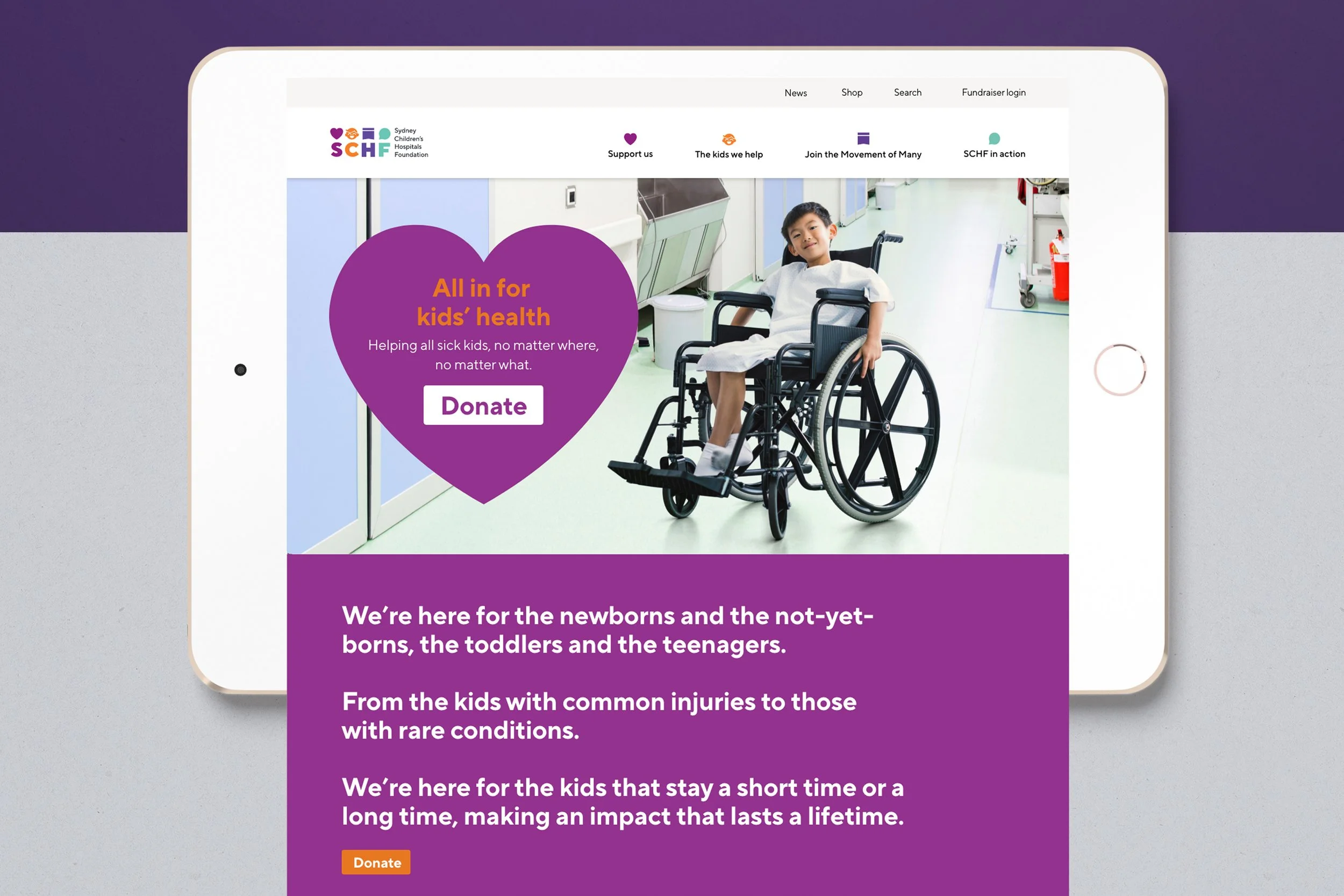
Championing kids’ health
One of the largest and most trusted kids’ health charities in the country, Sydney Children’s Hospitals Foundation (SCHF) exists to help provide all children with access to the best possible healthcare, whenever and wherever they need it. The Foundation has been delivering on this promise for over 35 years.
After expanding its remit to fundraise for two major paediatric hospitals and three health services in NSW, the Foundation needed a dynamic new brand to reflect both its increased footprint and its ambition to be a mechanism for powerful change in kids’ health.


A rapidly changing charity landscape and unprecedented changes in donor behaviour presented SCHF with the opportunity to better engage audiences and unify donors.
Interviews, workshops, surveys, audience profiling, category and competitor analysis left no stone unturned. Research unearthed SCHF’s unique position as a change agent with one foot at the front line and one in the future of kids’ health, achieving both immediate effects and long-term impacts, changing one kid’s life today and future-proofing the health of all kids tomorrow.
The strategy was to create a brand that conveyed the Foundation’s attitude, ambition and capabilities with a single unifying goal: All in for kids’ health.
Research and strategy


Building the brand
To create a vibrant, contemporary brand, all design elements were carefully crafted to move the Foundation to where it needed to be as well as provide solutions to existing issues. The new brand is flexible, dynamic and solutions-focused. Visual, verbal and sonic branding assets were supported by a robust design hierarchy with a varied and growing audience in mind.
An extensive design system gave the Foundation a wide set of tools that covered every need for every audience. An online brand hub consolidated all brand assets in one place, helping the Foundation’s team access, share and grow the brand quickly and expertly.


Building a community
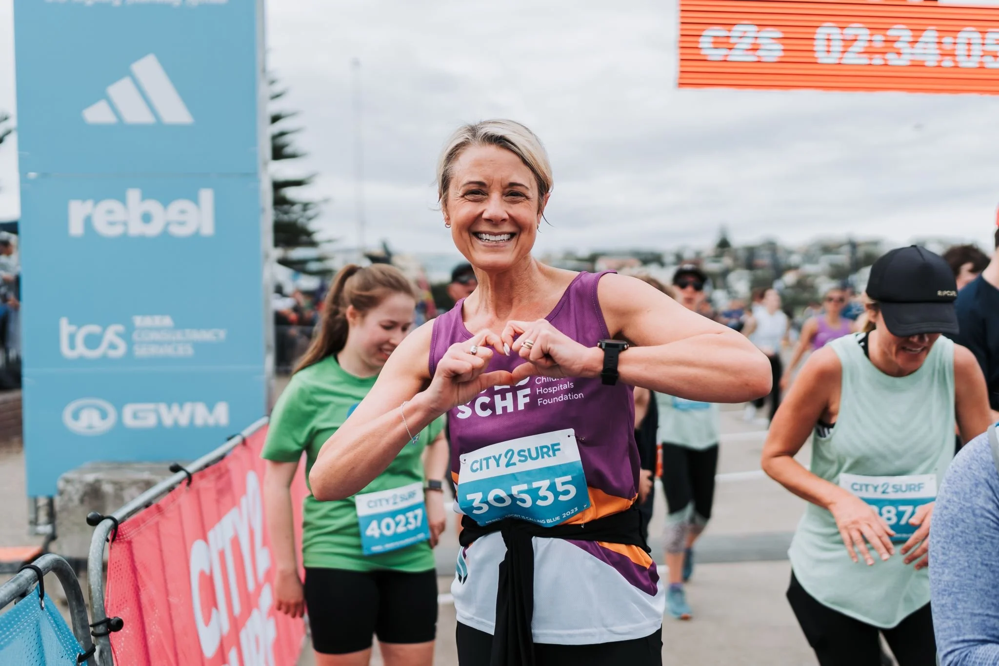
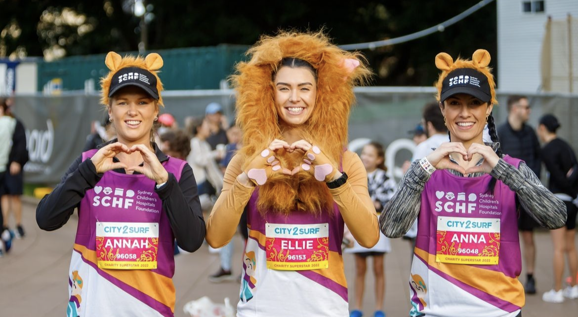
SCHF’s 70,000 supporters have a powerful collective impact on kids’ health. For the first time in the Foundation’s history, the supporters were identified as a group, the Movement of Many, and represented in the brand.
The tie that binds the Movement of Many imagery together is the use of the hand-heart gesture. The hand-heart gesture represents the heart in the SCHF logo, which is the symbol of giving. This is a way for the Movement of Many to show their support in photos and films, align with the team at the Foundation, recognise each other at events and online, and connect with the kids they support. It’s both an identifier and a statement, one that has been wholeheartedly embraced by the community it represents.


Representing 170,000 kids
Two characters were developed to represent the 170,000 kids that SCHF helps each year and the many, many more that will get the help they need for generations to come. These happy-go-lucky characters who need a helping hand with their health represent all kids - all experiences, all conditions, and all stages of their health journey.


Impact
SCHF now speaks with a single, united brand voice while making a greater impact on children with its broader mission. For the first time in its history, it has unified its 70,000 supporters under one banner, the Movement of Many.
This game-changing approach has modernised the Foundation’s donor engagement, driving a 48% rise in donations via the new SCHF website two months after the launch of the new brand, compared to the same period the previous year.
Since the rebrand launched in November 2021, the Foundation has moved from raising $62.2 million in 2020 to raising over $100 million in 2024.
SCHF is on an exciting and significant trajectory, evolving and adapting to meet the needs of sick kids in an ever-changing world.

The SCHF rebrand has won ten national and international awards.
BETTER FUTURE
BETTER FUTURE is the world’s largest network of design award programs.
Australian Design Awards
Silver | Identity and branding
GOV Design Awards
Silver | Identity and branding
Sydney Design Awards
Silver | Identity and branding
Wild Design Awards
Silver | Graphic design - Identity and branding - community
Indigo Design Award
The Indigo Design Awards celebrates outstanding design achievement.
Silver | Branding
Muse Awards
The Muse creative awards is a global advertising awards platform celebrating excellence and innovation.
Gold | Branded content
Transform Awards
The Transform Awards honours and rewards the most innovative, creative and successful brand work in ANZ.
Gold | Best brand evolution
Gold | Best visual identity by a charity, NGO or NFO
Gold | Best visual identity from the healthcare and pharmaceuticals sector
Winner | Best overall visual identity
Transform Awards ANZ, Jury